Text rendering layouts
By default, the rendering service text rendering follows the typical typographic rules just like most common text editors do. While this mode provides a predictable and consistent text layout, in some cases it may be desirable to override some of the functionality.
This need most commonly arises when there are strict text boundaries that the text must strictly adhere to; or when it is desired to utilize the available space in the most efficient manner.
Configuring layout types
The layout type is controlled using layout layer parameter when rendering text.
Supported values:
typographic– default behavior.tight– enable special text rendering path.
Performance impact
Please note that there is a minor rendering performance impact when enabling tight layouts.
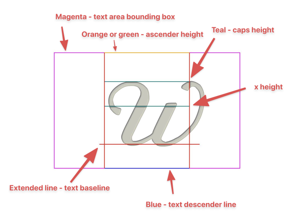
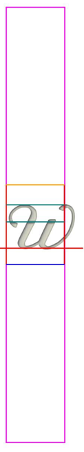
Image legend
Samples below use te following color coding for text and font features:
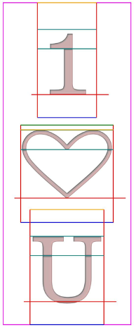
Tight layout impact comparison, horizontal text
Standard layout | Tight layout |
|---|---|
 Centered horizontally/vertically, no autosizing. Note that the text is centered using it’s typographic bounds | 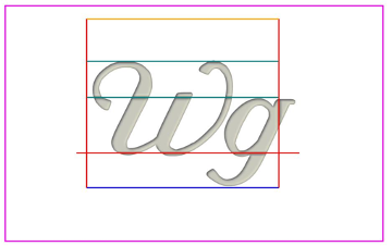 Centered horizontally/vertically, no autosizing. Unlike typographic layout, the text is “dead-centered” within the text area. However, consider your aesthetic needs as well: As font designers may allow some characters to overflow a character box, overall effect text positioning may feel less balanced than typographic layout. |
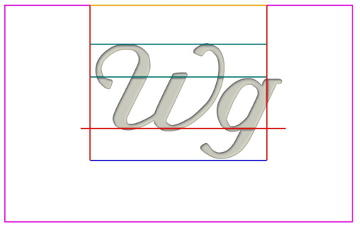
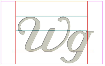
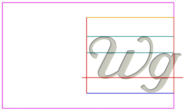 Right aligned, text overflows the allowed text area because of the “g” glyph slant. | 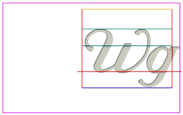 Right aligned, no text area overflow. |
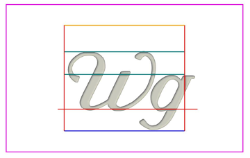
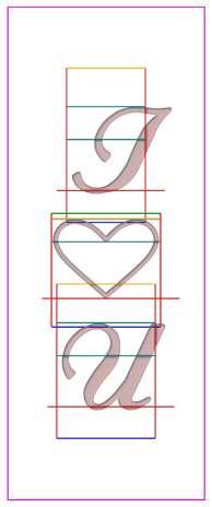
 Top aligned, the text is aligned on the ascender height. Note that in this case the position of the baseline is stable and doesn’t depend on entered characters. | 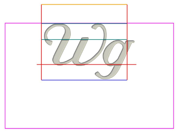 Top aligned, text is aligned perfectly with the top border of the text area In the case of tight layouts, the text baseline position depends on characters typed. For example, if a user types a mix of caps/lowercase characters, they may notice the text image “jumping” when the baseline gets repositioned: 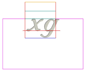 |
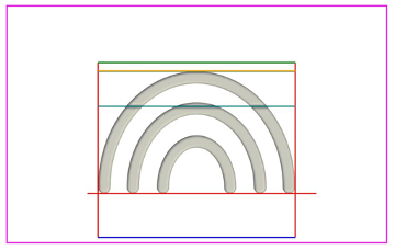
 Center aligned, autosizing enabled (starting from a very large font). The text size is determined using the font ascender and descender height. | 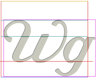 Center aligned, autosizing enabled. The text size is determined by the exact outline dimensions and this fills the text area completely. |
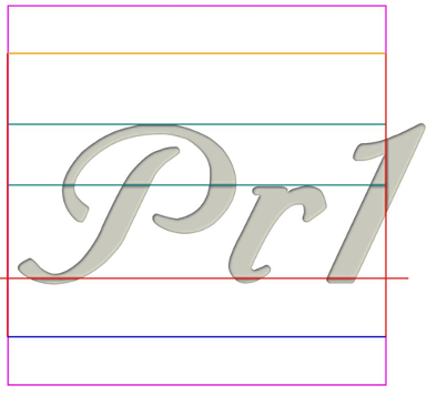 Center aligned, autosizing enabled. Compared to the tight layout, text glyphs may overflow the allowed area because of the font slant. | 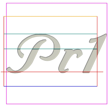 Center aligned, autosizing enabled. As with all autosized tight layouts, characters are not allowed to overflow the allowed text area. Resulting font sizing is smaller to accommodate the font slant. |
 When using special or icon characters, the main font of the text area determines the baseline and other font characteristics. As the result, applying autosizing may yield different results depending on the font selection. | 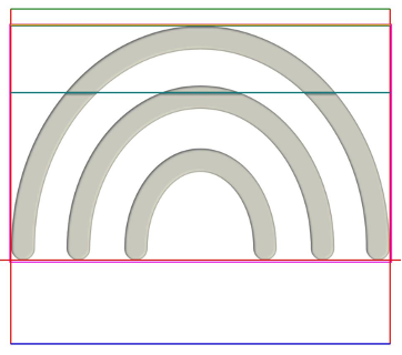 Tight layouts use the exact glyph outline, and have consistent sizing as the result. |
Text rendering comparison, vertical text
Standard layout | Tight layout |
|---|---|
 Overall, the effects on rendering the vertical text are similar to the horizontal text. However, there are a few nuances. In typographic layouts, each character is aligned using its character box. On italic or heavily slanted fonts, this may create an “unbalanced” perception. | 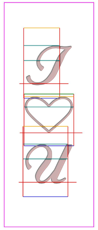 Tight layouts characters are aligned and centered using the exact outline. |
 On typographic layouts, font sizing is done similarly to horizontal text using ascender and descender heights. | 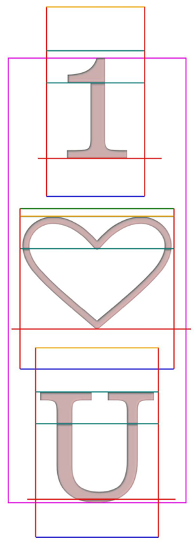 Tight layouts use exact glyph outlines. |
 Typographic layouts may overflow the text area when aligning and sizing characters because of the font slant and other font designer considerations | 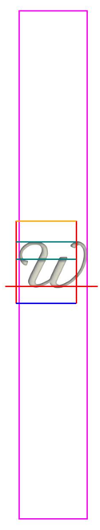 Tight layouts are not allowed to overflow the text area. |