Setting up a stock options gallery
A metadata set for stock images gallery can be generated automatically with the help of the configuration wizard. The section below describes in-depth metadata configuration for more complex use cases.
In order to set up an image gallery, a few metadata components would need to be created:
Create a component option definition that will be the base for future option objects
Create a component type to specify part code formatting
Create a component placement to provide a well-defined placement name, in case of it is required later for custom functionality
Create a product with a single group, and associate the created placement with it.
Finally, create an empty package on the product
Once all prerequisites are complete, navigate to the product and select Manage Gallery from the More menu. If the prerequisites are valid, a configuration choice will be shown:
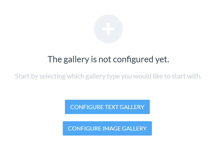
Select the desired gallery type and continue.
Navigating to the gallery
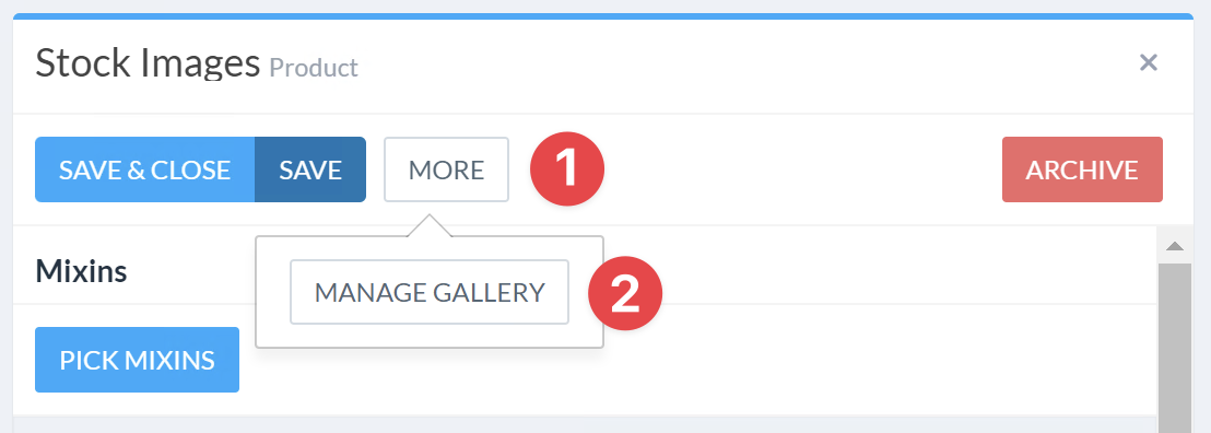
To open the gallery management panel, navigate to the product that is designated for holding gallery options, and select Manage Gallery option from the More menu.
Gallery settings
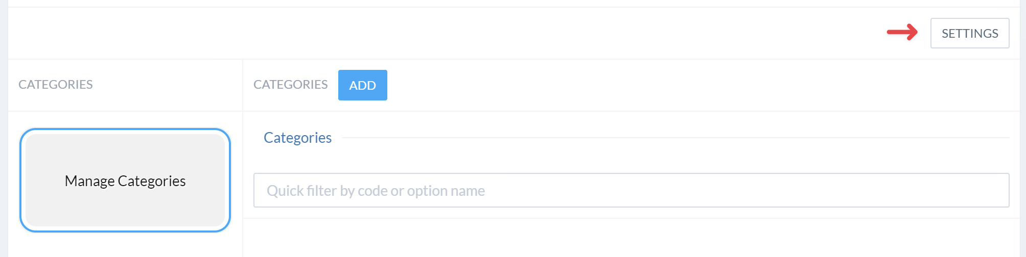
Additional gallery settings can be configured after the gallery has been created. To do so, select Settings menu in the gallery view.
The following options are available:
Option name | Example value | Description |
|---|---|---|
Translation sites and locales | en, de, es | A list of locales that stock options can be translated to |
Option prefix | StockImage- | Assigns a common prefix to all created stock options, which may help with browsing and filtering the administration UI |
Maximum image width applies to image galleries only | 6000 | Maximum allowed image size to be uploaded to the gallery |
Maximum image height applies to image galleries only | 6000 | Maximum allowed image size to be uploaded to the gallery |
Image fitting method | One of:
| Defines the uploaded image handling, see the table below. |
Uploaded image fitting methods:
Method name | Description |
|---|---|
contain | If an uploaded image dimensions are greater than maximum allowed image dimensions, the image will be shrank until it fits. |
contain-extend | Simiar to |
cover | The uploaded image will be scaled up to ensure that it covers the entire defined image area. If the resulting image is greater than the defined image area, it will be retained as-is. |
cover-crop | The uploaded image will be scaled up to ensure that it covers the entire defined image area. If the resulting image overhangs the image area, it will be cropped to remove the excess. |
crop-extend | If the uploaded image is larger than the defined area, it will be simply cropped. The resulting image size is extended with a border to match the defined area dimensions. |
fit | A combination of both |
fit-extend | A combination of both |
Custom forms
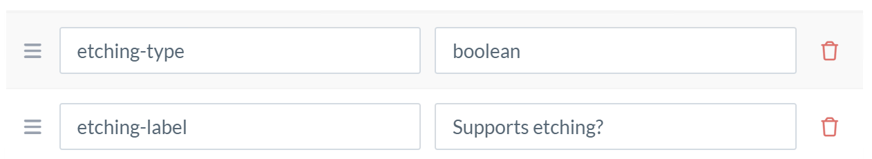
Gallery options may have custom forms associated with them. Forms are defined using custom attributes section of the gallery configuration screen. In order create a custom form field, add three attributes:
Having the same prefix name
Ending with
-type,-label, and-optionsrespectively.
Form type
The -type attribute may the following values:
options- select a value from a list of optionsboolean- a checkbox valuetext- a free form textnumber- a number field
Form label
-label attribute should contain the field name.
Checkbox form element example
For example, a form field that defines whether an option is applicable for Laser Etching:
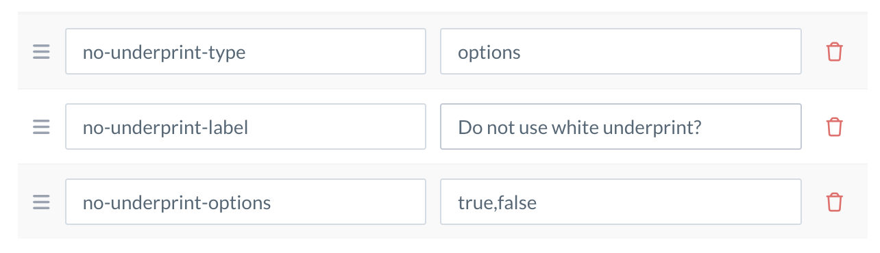
Options form element example
For example, a form field that defines whether a stock image should have an underprint layer.
-options attribute should contain a comma-separated list of available options.